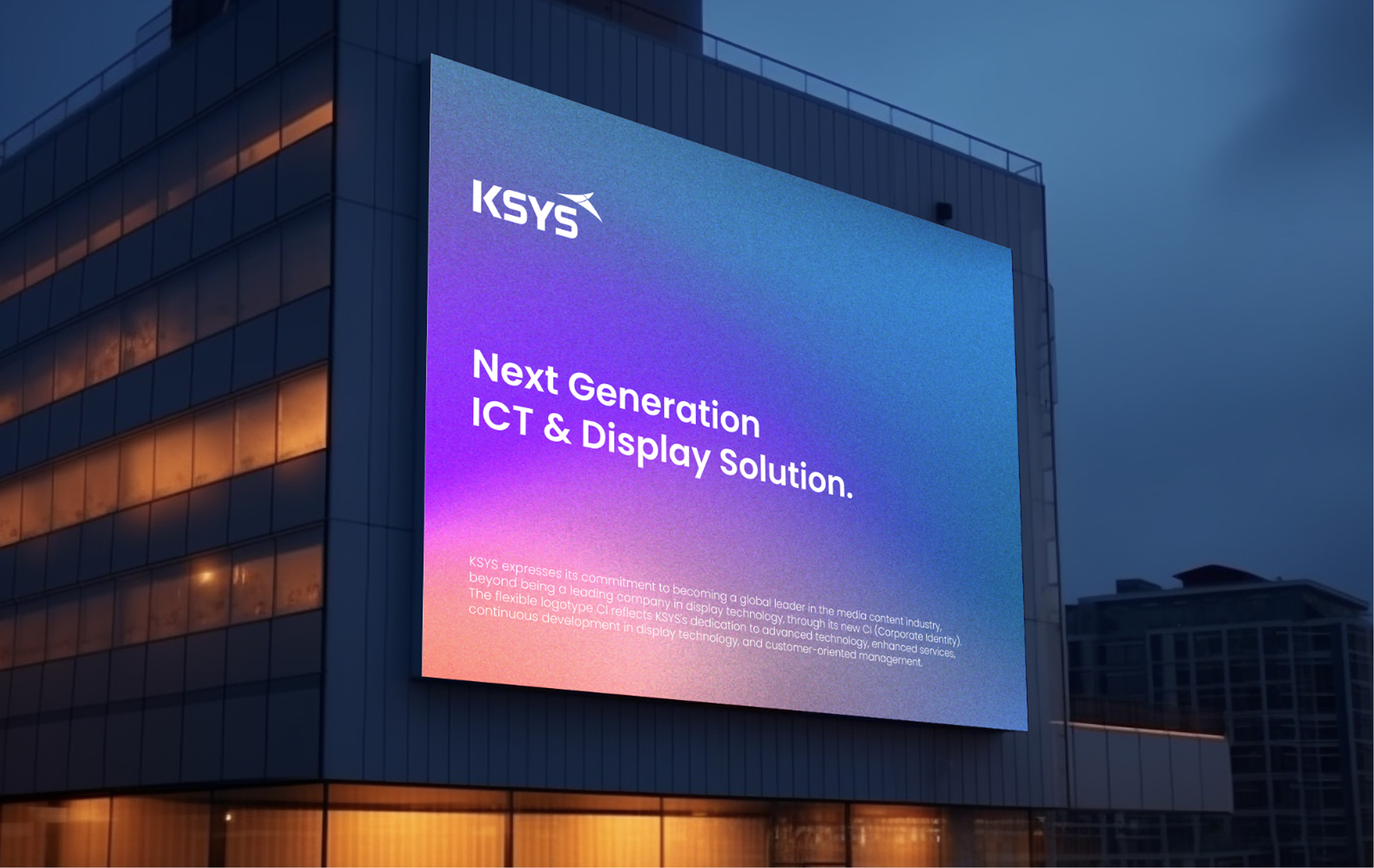
evolving into a global leader in media content
through advanced technology and enhanced services
and establish itself as a global leader in the media content industry,
delivering advanced technologies and elevated service experiences.
The flexible logotype embodies KSYS’s continuous technological innovation,
pioneering spirit, and customer-centric approach.
Clear Space Guidelines
The logomark is a core visual asset that represents KSYS across all internal and
external communications.
Therefore, when using or reproducing the logomark, it must be scaled
proportionally based on the original artwork data.
If reproduction is unavoidable, it should be
constructed accurately using the designated grid system.
The clear space defines the minimum area
that must remain free from any surrounding elements to ensure the integrity of the logomark.
KSYS Signature
The KSYS signature embodies continuous technological innovation, a spirit of
challenge,
and a customer-centric approach through a flexible logotype-based CI.
The pink
element in the symbol represents creativity and challenge,
reflecting KSYS’s clear vision of going
beyond installation to deliver expressive display experiences.
The blue element symbolizes trust
and reliability,
expressing the company’s pride in its technology and its strong sense of
expertise.
reflecting KSYS’s clear vision of going beyond design to deliver expressive display experiences.
The blue element symbolizes trust and reliability,
expressing the company’s pride in its technology and its professional expertise.
represents technological convergence and a forward-looking corporate vision,
completing the distinctive identity of KSYS.